 |  |
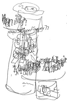
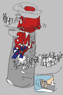
3m super 77 adhesive
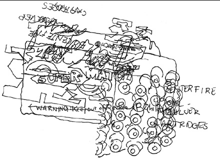
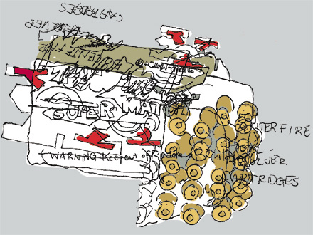
well, i tried coloring these two, but i cannot say that i'm totally happy with the results. but i don't think that they look quite right plain either, so i'm posting both. but these are my responses to sutter's typography challenge.


western supermatch cartridges
Hehehehehehe!
ReplyDeleteThese are cool, kind of hectic and crazy! I like them.
ReplyDeletewow, love the sense of movement bc's create with type, floating off and marching away!
ReplyDeleteMaybe it's just me but I love BCC drawings of items much more than eyes open ones. They are so much fun to see.
ReplyDeleteQuite impressive BCs! Looky at all the details! Well done, seeks!
ReplyDeletethese are friggin rad, Jes. good touch of color. See you on the firing range.
ReplyDeleteThese are great! Love the movement the bullets seem to convey, even though they're just stacked.
ReplyDeleteThe SEEKS! i can't believe i didn't see this until now. you freaking are amazing. JERK~! you always make sutter and i look like schmucks.
ReplyDeletethe bullet box is crazy awesome.
again, YOu are the bcf winner.
goodness!
niff. you are crazy. did you look at your bc's? crazy i tell you. i never met such a reluctant bcf winner as niff.
ReplyDeleteThese are AMAZING. I'm jealous (in a good way!).
ReplyDelete