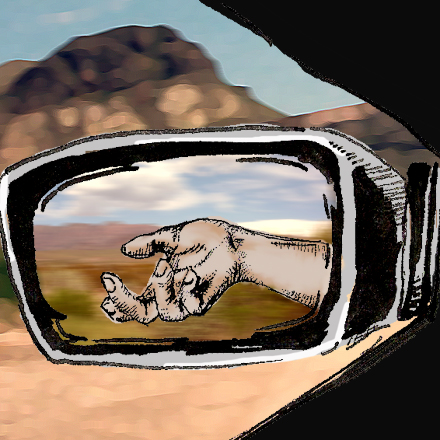
in the car
i drive to work, and sometimes get stuck waiting for cars to move. and when i do, i look at my hand in the sideview mirror and think how that may actually be a nice image. i did this drawing thinking it'd give me a slightly different way of seeing my hand, and it did. then i played with my wider nibs and ink... came up with a comic like feel.
i dunno. this whole thing is just a way to play with my options. since i don't have any pictures of my streets here in baltimore, i used some pics from my honeymoon (these were from big bend national park). not sure how i feel about the whole thing, though i'm still fond of the idea.
I lo-ove this!! The line quality of the hand, the double background of mirror bg plus the view beyond, and the gesture itself--just ripe for a story!!
ReplyDeleteWhat a great illustration for a short story or a book cover!
Perhaps the images from your trip is wishful thinking - that you would rather be in the national park instead of in the traffic on the way to work.
ReplyDeleteYour illustration is imaginative and creative. Well done!
Cheers,
Robyn
Scratches & Scribbles
Very cool, I like the mixed media approach.
ReplyDeleteDetlef
http://www.detlefjumpertz.com
really nice, jes. the movement of the bg and the mirror bg is done well
ReplyDeletereally interesting composition and idea!! Have to try this
ReplyDeleteReally nice! I love how you experiment and easily adapt new styles. What a talent!!!
ReplyDeleteWhat a neat viewpoint! And nice sketch.
ReplyDeleteI love this. I am always taking quick pics with my cell phone of the world reflected in my mirror. I love the idea of drawing something that I see in it.
ReplyDeleteI too like the idea, but as a whole I don't like the mix of dark inky drawn foreground and a very digital pastel background. Your hand drawing is amazing though. I think if you had a darker more urban background or at least more inky and not so digital i would like the piece as a whole more, but i can see you have a lot of fans, so It's just my 2 cents. Great idea non the less.
ReplyDeletethanks for the feedback niff. i can see where you're coming from. i think i'd actually prefer to try to do something a bit less digital. some collage work i think would work nicely with it. and the dark & more urban bgs were really more of what i had in mind. the actuall drawing is so small, though, i don't feel like collage would be all that effective either. i'm definitely struggling with this piece.
ReplyDeletethanks for all the other wonderful and encouraging comments, everyone! the encouragement i receive from y'all never ceases to amaze me.
I'm no artist but I know what I like I think this is great. I was just browsing and stopped at this, I think is very interesting!
ReplyDelete